American electricity data - for a perspective on Ontario costs
Electricity prices, and costs are aspects of a project I'm trudging through working with electricity data from the United States. I've developed a Power BI report which probably deserves a lot slicker interface, but time is limited. This post offers directions on controlling the reporting, and adds some Ontario context to the graphics.
My primary intent was to create imagery of average monthly electricity cost, by state, for residential consumers. Rates get a lot of discussion, even more so in recent weeks, but I'm not convinced an isolated rate analysis is useful.
A recent Scientific American article featured a smart BI report by Abhilash Kantamneni ( @akantamn on Twitter ).
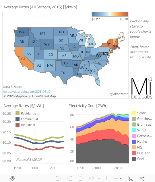
Due to an exchange on Twitter I'd had with Abhilash a couple of weeks ago, I wanted to build a view that showed both rates, and average monthly consumer costs - because it turns out these are much different things.

The BI report I've created to check cost is at https://goo.gl/vA3fZk - probably best experienced using a full screen, I'll use some screen captures to show the functionality.
https://app.powerbi.com/view?r=eyJrIjoiNzZiOGIyMzItZWUxYS00MzliLTgzM2ItZWE2Y2JmNmM1OGI1IiwidCI6IjMxNGYyMDc3LTFjZjAtNGI2NS05OTdkLWFmYzYxN2ZjYzU0NiJ9
The different elements in the reporting require different data filters to be most meaningful. I apologize to Alaska and Hawaii - your data is interesting (particularly Hawaii's), but including you would make the maps just too large to be graphically impactful.
Specific filtering is included (as splicers) for sector, and year. Sector is important: all sectors (which you get by not having none selected) is useful for comparing overall rates between states, but it's not certain, or even likely, average monthly bill figures for industrial consumers would be similar from state to state - and I don't know that commercial or transportation sectors would be either. For comparing monthly bills, I am therefore interested in residential data.
The year splicer/filter is a less useful tool on the second tab (which shows values adjusted to reflect real 2017 US dollars). It's simpler to simply select a column from the tabular annual data which triggers the maps to reflect only the data for that year (initially the maps show the average rate and monthly billing for all years).
The following screen capture shows the report's 2nd page ('Real 2017 dollars') filtered to residential data with 2015 highlighted in the tabular display of average monthly billing - so the maps display average rate (on the left) and average monthly bill (on the right) - and those are clearly two very different things.

Some quick comments on this real dollar data:
The fist page/tab of my report, 'Nominal', does not adjust dollar values. The 'year' splicer/filter is important to make the maps meaningful, but selecting a year detracts from the bubble chart. Note, in this screen capture of the page filtered to display 2017 Residential data, the "focus mode" switch that appears in the upper right portion of bubble chart when that section is moused over.

Deselecting 2017 and switching to focus mode on the bubble chart allows playing the annual history of data on rate (vertical axis) and consumption (horizontal) by state - highlighting a state (Connecticut in the screen capture) traces the movement from year to year.

I drew the red line on here which some might think shows an economic relationship between price and demand. And it might, but it might be more indicative of the political constraints on pricing where demand is higher due to factors such as cooling degree hours, heating degree hours, residential structure (adjacent to heated/cooled spaces on 5 of 6 sides, or detached house), availability of alternate energy sources (such as natural gas), etc.
In much of my work I've tried to note how unique, in North America, Ontario's escalating rates have been. I'd be happy if others could work the data reports I produce to find other messages.
NOTES:
My primary intent was to create imagery of average monthly electricity cost, by state, for residential consumers. Rates get a lot of discussion, even more so in recent weeks, but I'm not convinced an isolated rate analysis is useful.
A recent Scientific American article featured a smart BI report by Abhilash Kantamneni ( @akantamn on Twitter ).
Due to an exchange on Twitter I'd had with Abhilash a couple of weeks ago, I wanted to build a view that showed both rates, and average monthly consumer costs - because it turns out these are much different things.
The BI report I've created to check cost is at https://goo.gl/vA3fZk - probably best experienced using a full screen, I'll use some screen captures to show the functionality.
https://app.powerbi.com/view?r=eyJrIjoiNzZiOGIyMzItZWUxYS00MzliLTgzM2ItZWE2Y2JmNmM1OGI1IiwidCI6IjMxNGYyMDc3LTFjZjAtNGI2NS05OTdkLWFmYzYxN2ZjYzU0NiJ9
The different elements in the reporting require different data filters to be most meaningful. I apologize to Alaska and Hawaii - your data is interesting (particularly Hawaii's), but including you would make the maps just too large to be graphically impactful.
Specific filtering is included (as splicers) for sector, and year. Sector is important: all sectors (which you get by not having none selected) is useful for comparing overall rates between states, but it's not certain, or even likely, average monthly bill figures for industrial consumers would be similar from state to state - and I don't know that commercial or transportation sectors would be either. For comparing monthly bills, I am therefore interested in residential data.
The year splicer/filter is a less useful tool on the second tab (which shows values adjusted to reflect real 2017 US dollars). It's simpler to simply select a column from the tabular annual data which triggers the maps to reflect only the data for that year (initially the maps show the average rate and monthly billing for all years).
The following screen capture shows the report's 2nd page ('Real 2017 dollars') filtered to residential data with 2015 highlighted in the tabular display of average monthly billing - so the maps display average rate (on the left) and average monthly bill (on the right) - and those are clearly two very different things.
Some quick comments on this real dollar data:
- monthly bills have changed very little in real terms (the average of all years is $113 and 2017's average is $112).
- in 2015 the highest monthly bill among the continental states looks to have been Connecticut - I wrote, "a poor Connecticut: Ontario Electricity Pricing" in 2016.
- The average residential bill in Connecticut dropped 11% from 2015-2017.
The fist page/tab of my report, 'Nominal', does not adjust dollar values. The 'year' splicer/filter is important to make the maps meaningful, but selecting a year detracts from the bubble chart. Note, in this screen capture of the page filtered to display 2017 Residential data, the "focus mode" switch that appears in the upper right portion of bubble chart when that section is moused over.
Deselecting 2017 and switching to focus mode on the bubble chart allows playing the annual history of data on rate (vertical axis) and consumption (horizontal) by state - highlighting a state (Connecticut in the screen capture) traces the movement from year to year.
I drew the red line on here which some might think shows an economic relationship between price and demand. And it might, but it might be more indicative of the political constraints on pricing where demand is higher due to factors such as cooling degree hours, heating degree hours, residential structure (adjacent to heated/cooled spaces on 5 of 6 sides, or detached house), availability of alternate energy sources (such as natural gas), etc.
In much of my work I've tried to note how unique, in North America, Ontario's escalating rates have been. I'd be happy if others could work the data reports I produce to find other messages.
NOTES:
- I have recently produced a report on US generating capacity.
- Other BI reporting can be found through my data site.


Comments
Post a Comment